18.10.2023 - 29.11.2023 ( Week 8- Week 13)
Gam Jze Shin / 0353154
Advanced
Typography / Bachelor of Design (Hons) in Creative Media
Task
3: Type Exploration and Application
Index
1. Lectures
2. Instructions
3. Feedback
4. Reflection
5. Further Reading
Lectures
Refer to Task 1: Exercise.
Instructions
Task 3
In this task, it offers three distinct options for selection:
a) Develop a font to tackle industry challenges, creating a fully usable (.ttf) font.
b) Enhance an existing letterform in your field, resulting in a practical (.ttf) font.
c) Conduct an original experiment—3D materials, digital augmentation, or unique concepts to define the final outcome.
Highlight = Selected method.
Idea Proposal
I spent some time thinking about which field or aspect should I go to solve the problems faced by the font. After brainstorming, I summarized a few of my own ideas in idea proposal.
According to Mr. Vinod, the first and third ideas are deemed uninteresting, especially since the game already has an existing font. The second idea, centered around a Zoo theme, is considered challenging due to the multitude of animals in a zoo. However, there is potential by focusing on specific animals, making it easier to develop unique fonts.
fig 1.1 Final idea proposal (Week 8, 17.10.2023)
After receiving feedback, I opted to create a font specifically for a fish shop. Mr. Vinod approved the idea and advised me to commence the sketching process.
Research
fig 1.2.1- 1.2.2 References from Pinterest (Week 8, 17.10.2023)
I find some similar reference in Pinterest and observed that each font incorporates a consistent design element. For example, in the left picture, the recurring element is water, while in the right picture, it features the tail of a fish. fig 1.2.3- 1.2.4 The head and tail of a fish (Week 8, 22.10.2023)
I have found simple fish drawings online for reference. Additionally, for the ascender and descender of the font, I plan to integrate the concept of a fish's tail.
Sketches
fig 1.3.1 Sketch attempt 1 (Week 9, 25.10.2023)
fig 1.3.2 Sketch attempt 2 (Week 9, 25.10.2023)
After conducting research on the fish theme, I created rough sketches in Adobe Illustrator and presented them to Mr. Vinod. I explored two different styles during this phase, and Mr. Vinod expressed a preference for the second style, advising me to proceed with it. Therefore, I decided to digitally refine and finalize the font using the chosen second style.
Digitalization
fig 1.4.1 Box guideline (Week 10, 31.10.2023)
First, I used the tools that working with guides in Illustrator (Ctrl + R) for me to manage the height of font better. Then, I created a grey box (545px X 693px) in order to make sure every letters that I designed not exceed it.
fig 1.4.2 letter ‘H', ‘O' , ‘A,' and ‘N' (Week 10, 31.10.2023)
Then, I started to create the letter ‘H', ‘O' , ‘A,' and ‘N' as Mr. Vinod said it can used as foundational strokes for letters and manipulate for the rest.
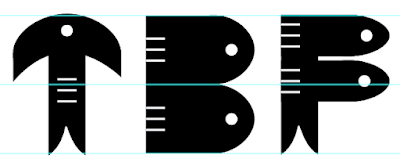
fig 1.4.3 letter ‘T', ‘B and ‘F' (Week 10, 31.10.2023)
Some letter strokes have distinct styles. For instance, the upper horizontal line of ‘T' differs from the vertical stroke of ‘H'. Additionally, the curves in ‘B' and ‘F' vary from the vertical strokes in other letters. Hence, I created these few letters first.
Digitalization (Uppercase) 
fig 1.5.1 Uppercase (Week 10, 1.11.2023)
 fig 1.5.2 Uppercase with outline (Week 10, 1.11.2023)
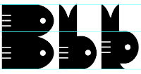
After I finished the Uppercase letter, I arranged it properly in an artboard and showed it to Mr. Vinod in week 10 class.

fig 1.5.3 Disparity of the
sharpness (Week 10, 1.11.2023)
Mr. Vinod advised me to be mindful of
the sharpness of the strokes,
emphasizing that they shouldn't be
overly sharp. The image above
illustrates the difference in stroke
sharpness, with the right side depicting
strokes before refinement and the left
side showing strokes after refinement.
The refined strokes on the left are
visually better than those on the
right.
Digitalization (Lowercase)
fig 1.6.1 Lowercase (Week 10, 4.11.2023)
fig 1.6.2 - 1.6.3 Lowercase
with outline (Week 10, 4.11.2023)
fig 1.6.4 The letter b and
d (Week 11, 7.11.2023)
I crafted two variations of ‘b' and ‘d' and felt uncertain about which to
use. Ultimately, I opted for the first
version without a sharp stroke at the
bottom as it aligns better with the
overall consistency of my font style.
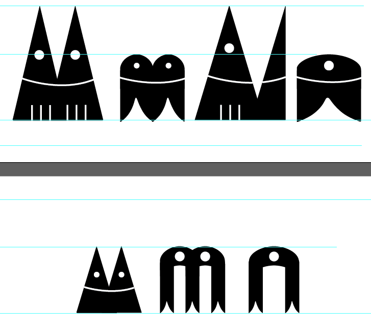
fig 1.6.5 The letters of m and
n (Week 11, 7.11.2023)
For the lowercase letter of ‘m' and ‘n', I generated multiple designs, arranged them for comparison, and concluded that the upper one is superior.
Digitalization (Numbers)
fig 1.7.1 Numbers (Week 11, 7.11.2023)
fig 1.7.2 Numbers with
outline (Week 11, 7.11.2023)
After done the uppercase and lowercase letters, I used the same element that I used in previous part which is the head and tail of a fish in creating numbers.
fig 1.7.3 Number 2 (Week 11, 7.11.2023)
As the number ‘2' have the curve of it, so it is a bit challenge for me to create and I tried to combine the horizontal stroke of letter ‘T' and the curve of letter ‘q' .
fig 1.7.4 Number 3 (Week 11, 7.11.2023)
I consulted Mr. Vinod about the
choice of ‘3' between two options.
Although the right one maintains
consistency in my font, it
resembles the number ‘8', potentially causing confusion.
Consequently, I opted for the left
one.
Digitalization (Punctuations)
fig 1.7.5 Punctuations (Week 11, 8.11.2023)
fig 1.7.6 Punctuations with
outline (Week 11, 8.11.2023)
Lastly, I proceeded with designing the punctuation for my font. Due to time constraints, I didn't design all the punctuations, only a select few.
Digitalization (Final set)
fig 1.8.1 - 1.8.6 The final
set of Type Exploration (Fish
font) (Week 11, 8.11.2023)
Fontlab 8
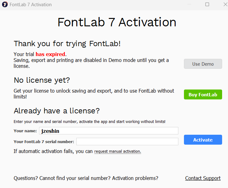
fig 1.9.1 FontLab 7 expired (Week 11, 11.11.2023)
As my FontLab 7 has expired because of using it in last semester in typography, I decided to download FontLab 8.
fig 1.9.2 - 1.9.3 The structure of letter
A (Week 12, 13.11.2023)
I noticed that if I paste my letterforms directly into the FontLab 8 by using the left letterform, it will have the extra stroke on it and the white stroke and white circle will include on it.
fig 1.9.4 Letter A (Week 12, 13.11.2023)
Hence, I used the function (path) > Outline stroke and convert the line into shape. Then, I used shape builder to cut out the white stroke to make it transparent (as the letter shown in right).
fig 1.9.5 Combination structure of Fish font (Week 12, 13.11.2023)
Next, I used shape builder to combine all the line and shape of all letters into one in order to transform it into FontLab 8.
fig 1.9.6 FontLab 8 (Week 12, 14.11.2023)
Next, I transform the letters that I have from Adobe Illustrator to FontLab 8 by pasting it and also remove some of the extra shape and stroke.
fig 1.9.7 Kerning in FontLab 8 (Week 12, 14.11.2023)
When I done pasting all the letters that I created, I adjust
some kerning on it as some of the letters may overlapping if
I did not kern it.
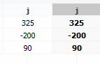
fig 1.9.8 - 1.9.9 The space between letter j
(before) (Week 12, 14.11.2023)
I found that most of the letter include descender
will overlap to each other. For instance, the
letters ‘j' and ‘g'.


fig 1.9.10 - 1.9.11 The space between letter j
(after) (Week 12, 14.11.2023)
I kern the space between two letter ‘j' into 150 to make sure the proper spacing when typing the font.
fig 1.9.12 Install Fish Font (Week 12, 15.11.2023)
Last but not least, I export my designed typeface and
named it as ‘Fish Font'. I install it so that I can use it for my font presentation and font application.
Font Presentation
fig 1.10.1 List down all typefaces (Week 12, 18.11.2023)
First of all, I listed down all the typefaces that I need
to include in my font presentation in an artboard (1024px X
1024px).
fig 1.10.2 - 1.10.3 References for font
presentation (Week 12, 18.11.2023)
From Pinterest, I observed some of the reference just
listed out all of the letters and placed it into a box
template.
fig 1.10.4 Font presentation
attempt 1 (Week 13,
20.11.2023)
Then, I tried to use fish net as
the guideline and arranged all the
letters into the hole of the next.
The background of the artboard I
used is the ocean.
fig 1.10.5 Font presentation
attempt 2 (Week 13,
20.11.2023)
As I think that the previous
layout is messy and unable to show
out my letterforms clearly, I
changed my mind which is creating
a font presentation for uppercase
first.
fig 1.10.6 Colour palette
for Font
Presentation (Week 13,
20.11.2023)
The colour palette I used is
about blue, indigo, white (near
to light blue), black (near to
dark blue).
fig 1.10.7 Font presentation attempt 3 (Week 13, 21.11.2023)
I include my uppercase letters,
numbers and some of the
punctuations on it. The upper part
of the layout, I applied the
outstroke of the font to show the
different between fonts with
outstroke and fonts with full
filled.
fig 1.10.8 Font presentation
(lowercase) attempt
1 (Week 13,
21.11.2023)
I am considering the fish bone
concept for my font, aligning
with the theme of the fish head
and tail. I have integrated the
lowercase letterforms along with
the fish bone lines.
fig 1.10.9 Font presentation (lowercase)
attempt 2 (Week 13,
22.11.2023)
In order to match with my colour
template theme, I adjusted the
colour accordingly.
fig 1.10.10Font presentation (lnumbers)
attempt 1 (Week 13,
22.11.2023)
For the numbers, I incorporated a
bubble concept, placing each
number inside a bubble of varying
sizes. Above, the word 'Numbers'
is positioned within a circular
shape to complement the bubble
theme.
fig 1.10.11 Numbers in
different style (Week 13,
22.11.2023)
I utilized strokes for certain
numbers to evoke distinct visual
sensations for viewers.
fig 1.10.12 Font presentation attempt
3 (Week 13,
22.11.2023)
In this font presentation, I
would like to use the
letter ‘A' as it is the main element and design style for my fish font.
 fig 1.10.13 Head of fish
concept (Week 13, 22.11.2023)
fig 1.10.13 Head of fish
concept (Week 13, 22.11.2023)
In the bottom left, the design
seemed a bit plain. To enhance
it, I created a subtle
variation by duplicating the
letter and placing it in
white. Instead of positioning
it directly behind the letter,
I placed it slightly beside
the letter, adding a touch of
vibrancy to the design.
fig 1.10.14 Blowing
bubble
concept (Week 13, 22.11.2023)
I positioned the punctuations next to the letter A to create the appearance of a fish blowing bubbles.
Final Font Presentation
fig 1.11.1 Final Font
Presentation 1 (Week 14,
28.11.2023)
fig 1.11.2 Final Font
Presentation 2 (Week 14,
28.11.2023)
fig 1.11.13 Final Font
Presentation 3 (Week 14,
28.11.2023)
fig 1.11.14 Final Font
Presentation 4 (Week 14,
28.11.2023)
Font Application
fig 1.12.1 Font
Application idea 1 (Week 14,
28.11.2023)
The first thing I would like to do for font application is fish shop sign. I found some reference in Google. Then, I replaced the font on it.
fig 1.12.2 Logo for fish
shop (Week 14,
28.11.2023)
As I saw most of the fish shop have their own logo, I also designed a logo for my fish shop.
fig 1.12.3 - 1.12.4
Fish shop sign (Week 14,
28.11.2023)
Based on the left image, I made some design changes such as font, logo, layout but with the same information.
fig 1.13.1 Font Application
idea 2 (Week 14,
28.11.2023)
The next idea is Fish shop stand up sign. There are a lot of references that I can refer to via online.
fig 1.13.2 - 1.13.3 Font
Application idea
2 (Week 14,
28.11.2023)
From the inspiration in the left, I used the design idea into the stand up sign. I choose the dark ocean background to emphasize the letters presented in a light blue color.
fig 1.13.4 -
1.13.5 Different
of the font
used (Week 14,
28.11.2023)
I experimented with the Fish font, but compared to other fonts, I find that alternative fonts are more visually appealing and suitable for viewing.
fig 1.14.1 Font
Application idea 3 (Week 14,
28.11.2023)
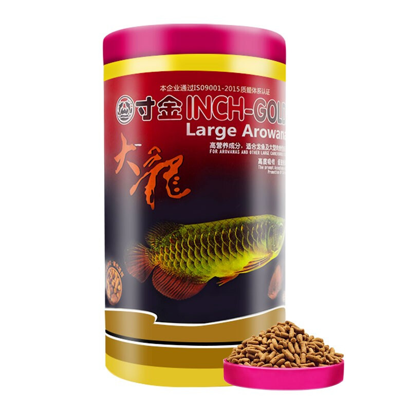
Then, I would like to apply my font on the package of fish food as the image above.
fig 1.14.2 - 1.14.3 Package of fish food (Before
and after) (Week 14,
28.11.2023)
The above images show the different between the original fish food package and after including fish font on fish food package.
fig 1.14.4 Logo
for package fish
food (Week 14,
28.11.2023)
The above left, I placed the logo that I designed myself on it.
fig 1.14.5 Tools
used (Week 14,
28.11.2023)
As the package is in cylindrical shape, I make a curve line and type the fish font text on the line.
fig 1.15.1 Font
Application idea 4 (Week 14,
28.11.2023)
My last idea is creating game card for different types of fish. It is inspirated from the Pokemon card.
fig 1.15.2 Progress in
Photoshop (Week 14,
28.11.2023)
Before I started doing it, I used Adobe Photoshop to remove the part that I don't want. The steps in Adobe Photoshop is selecting the unneeded part by using Lasso tool. Then, click Edit > Fill > Content Aware.
fig 1.15.3 Font
used different (Week 14,
28.11.2023)
On the left card, I utilized a different font for the information. Conversely, on the right card, I implemented my fish font and shared it with a friend. According to their feedback, the right card is considered more suitable and unique.
fig 1.15.4 Font
Application idea 4 (Week 14,
28.11.2023)
I had done two different fish
card.
Final Font Application
fig 1.16.1 Final Font
Application 1 (Week 14,
28.11.2023)
fig 1.16.2 Final Font
Application 2 (Week 14,
28.11.2023)
fig 1.16.3 Final Font
Application 3 (Week 14,
28.11.2023)
fig 1.16.4 Final Font
Application 4 (Week 14,
28.11.2023)
Final Type Exploration and
Application
fig
1.17.1
Final
Type
Exploration (Week 11, 8.11.2023)
fig
1.17.2
Final
Type
Exploration (Week 11, 8.11.2023)
fig
1.17.3
Final
Type
Exploration (Week 11, 8.11.2023)
fig
1.17.4
Final
Type
Exploration (Week 11, 8.11.2023)
fig
1.17.5
Final
Type
Exploration (Week 11, 8.11.2023)
fig
1.17.6
Final
Type
Exploration (Week 11, 8.11.2023)
fig
1.17.7
Final
Font
Presentation
1 (Week
13,
21.11.2023)
fig
1.17.8
Final
Font
Presentation
2 (Week
13,
21.11.2023)
fig
1.17.9
Final
Font
Presentation
3 (Week
13,
22.11.2023)
fig
1.17.10
Final
Font
Presentation
4 (Week
13,
22.11.2023)
fig
1.17.11
Final
Font
Application
1 (Week
14,
28.11.2023)
fig
1.17.12
Final
Font
Application
2 (Week
14,
28.11.2023)
fig
1.17.13
Final
Font
Application
3 (Week
14,
28.11.2023)
fig
1.17.14
Final
Font
Application
4 Week
14,
28.11.2023)
Feedback
Week 9
General Feedback: Commence the design process by creating the letterforms for ‘H,' ‘O' , ‘A,' and ‘N' initially. These letters will serve as foundational strokes that can be subsequently manipulated to construct the remaining letters. Maintain thorough documentation of each step in the design progression to establish a record and provide evidence of your authorship in the creative process.
Specific Feedback: Opting for a game concept is quite conventional. It's preferable to stick with the notion of crafting a font inspired by a zoo. However, the challenge lies in deciding whether to incorporate various types of animals or focus on a specific one. Using a variety of animals might introduce complexity. Besides, avoid to use excessive graphical elements while designing the letterforms.
Week 10
General Feedback: When designing the lowercase letter, put it beside uppercase letter to compare the different of stroke, height and shape.
Specific Feedback: Be mindful that the corners of letter strokes should not be overly
sharp.
Week 11
General Feedback: After completing the letter and adding punctuation, print it out to observe whether the finer details are noticeable.
Specific Feedback: Smooth out the stroke of the number ‘3' to eliminate any sharp edges.
Week 12
Absent
Week 13
General Feedback: The size of font presentations and font applications should be 1024 x 1024px.
Specific Feedback: The design in font applications should be easily discernible even from a distance.
Week 14
General Feedback : Complete the task 3 and final compilation before Friday.
Specific Feedback: Refer to the Lecture Playlist, include Preview and Type Font System into my blog.
Reflection
Experience
When tasked with designing a font based on a theme I had discovered,
I initially felt a bit hesitant and uneasy. It is because of a similar
challenge in the previous typography semester and I found to be quite
challenging. Selecting a theme for the font design posed an initial
challenge, and after a series of considerations, I ultimately opted
for fish as the central theme. Surprisingly, the process turned out to
be more smoother than I had anticipated, possibly owing to my
experience from the previous task. However, as the trial period for
FontLab 7 had concluded in the last semester, I had to adapt to using
FontLab 8 instead. Making words look interesting was a bit tricky, but
the final result was even better than I expected.
Observations
From this assignment, I noticed the importance of paying attention to
the sharpness at the ends of the font. Even the smallest details can
determine whether the font is successful or not, which can indirectly
impact the overall font effect. Additionally, the elements we design for
the font shouldn't be too small, as this might affect how well the font
is presented, especially in smaller situations where uniqueness is
crucial. I also observed how different fonts display on various items.
For instance, fonts on street signs need gaps between words for clear
visibility from a distance. On the other hand, when designing a typeface
for a very small item, precision is essential to make the font stand out
in a limited space.
Findings
I have noticed that crafting a complete typography design demands a
significant amount of time and effort. It differs from fine art or
general art where personal feelings guide creation. Font design adheres
to specific rules and procedures, especially when adjusting font
spacing. Precision is crucial because overlooking the spacing between
certain fonts can result in odd gaps, either too large or too small,
causing fonts to overlap when input. Additionally, capturing attention
with font presentation and application is essential. No matter how
beautiful a font is, it loses its impact if not presented in a suitable
manner.
Further Reading
fig 2.1Typographic design: Form and communication (2015)
Reference:
Carter, R., Day, B., Meggs, P. B., Maxa, S., & Sanders,
M.
(2015). Typographic design: Form and communication.
Hoboken, New Jersey: John Wiley & Sons, Inc.
Case Study (A typographic program for the 17th Street Farmers'
Market)
fig 2.2 Landscape
The sun sets on a horizon of aligned text type in this implied farm
landscape.
fig 2.3 Landscape
The tractor icon is inventively introduced into different
environments and contexts to surprise and delight viewers.
fig 2.4 Landscape
A colossal tomato is transported by a tractor, crafting a vivid and
unforgettable visual spectacle.
fig 2.5 Landscape
The letter 'O' in the word "tomato" is creatively replaced with the
wheel of a farm tractor. The expansive scale, oblique angle of the
type, and the warm color scheme collectively set the stage for an
event that evokes the warmth and vibrancy of a hot summer.
fig 2.6 Landscape
Occasionally employed in conjunction with typography to craft
thought-provoking messages. For instance, consider incorporating a
postcard for the International Brunswick Stew Festival, featuring a
series of international symbols such as a tractor, a passenger jet,
and a bowl, presenting an objective and visually engaging
display.
fig 2.7 Landscape
The term "opening" symbolizes the onset of a new market season,
mirroring the blossoming of a spring flower. The chosen typeface
combines organic and geometric elements, harmonizing seamlessly with
the essence of the flower.
)%20(2).png)


Comments
Post a Comment