.jpg)
22.4.2025 - 13.5.2025 ( Week 1- Week 4)
Gam Jze Shin / 0353154
Application Design II / Bachelor of Design in Creative Media
Task 1: App Design 1 Self-Evaluation and Reflection
Index
1. Instructions
2. Task 1: App Design 1 Self-Evaluation and Reflection
3. Feedback
4. Reflection
Task 1
This task requires us to perform a self-evaluation and
reflection on our initial application design (Design 1).
The results will be used to refine the application's
layout and aesthetic qualities, ultimately leading to a
better user experience.
My redesign project for Application Design 1 centers on
the Senheng app, a platform that enables users to buy
electrical appliances, furniture, and electronic
products online. The MVP I'm addressing involves the key
steps of the user shopping experience: product browsing,
purchase, and order tracking. Below are the
scenarios I have designed for my final project in
application design I.
Application Design I
Figma File
Click here to view the App Design I Figma File.
Prototype Link
Click here to view the App Design I Prototype Link.
Prototype Video
Scenario Selected for Redesign App
Scenario 1: Adding Products to Cart
As a new user of the Senheng app, imagine you have just
downloaded it. First, navigate to the category page and
find the Laifen product. Then, use the filter functions
to find the most suitable option and apply the filter.
Next, view the product's details and add the product to
your cart. After this, double-check to ensure that it
has been successfully added to your cart.
Scenario 2: Purchasing a Product
In this scenario, imagine you would like to find a
product using the Photo Search function. Click on any
product you like and view its details. Then, choose your
favorite options and proceed to payment until the
payment is completed.
Scenario 3: Tracking Your Order
Now, imagine you have completed your order and received
a notification. You would like to check your order form
to confirm your order. Then, you want to view the
tracking status of the product. After a few days, you
receive your order and want to find the history of your
order to view it.

Mr. Razif provided a template for interacting with AI,
which we can use to ask questions and guide the AI to
give feedback based on our specific requirements.
I asked previous students who had taken this module about which AI tools they used to get feedback for their app redesign. They recommended using Claude AI, as it provides detailed and structured responses that are helpful for evaluating design improvements and aligning with UI/UX principles.
Load In Page

fig 2.6 Load In Page


- Consistency: Establish a more consistent typography hierarchy for text sizes.
- Hierarchy: Reduce competition for attention between promotional elements and core functionality.
- Accessibility: Improve color contrast and increase touch target sizes.
- Clarity: Improve the phone number input field with a clearer label or placeholder text.
- Loading Screen Enhancement: Enhance the loading progress bar with a percentage or estimated time.
- Intrusiveness: Reduce the screen space occupied by the "Grand Opening" promotional pop-up and enlarge its close button.
- Usability: Increase the size and spacing of the top navigation icons.
- Clarity: Provide clearer labeling for the points display (e.g., "RM 5.20 (Balance)," "365 (Points)").


- Search Bar: Improve visibility by increasing contrast with the background.
- Quick Actions: Increase the font size of labels for better readability.
- Promotional Carousel: Add pagination indicators to show slide availability.
- Content Density: Increase whitespace to reduce clutter.
- Top Navigation: Enlarge icons for easier tapping.


Searching Page Feedback From Claude AI


fig 2.14 - 2.15 Searching Page Feedback (Claude AI)
Searching Image 1
- Visual Consistency: Product images have inconsistent styling.
- Information Accuracy: "58 Sold" text is identical across all products, reducing credibility.
- Text Readability: Some product titles are too long.
Searching Image 2
-
Text Readability: Some popular search thumbnails
contain text that's difficult to read at small
sizes
- Search History: Search history shows brand names but might benefit from showing product categories too.

Add to Cart Page Feedback From Claude AI


fig 2.17 - 2.18 Add to Cart Page Feedback (Claude AI)
General
- Unclear Checkbox Purpose: The checkboxes lack clear labels explaining if they are for selecting, deleting, or checking out items.
- Dense Pricing Information: S-Coin points and discount details are tightly packed, making them hard to read at a glance.
- Limited Spacing Between Item: Items are placed too closely together; adding vertical space would improve readability.
- Subtotal Positioning: The subtotal is aligned with the "All" checkbox, making it less visible and easy to overlook.
- Small Text Size: Text for important information (like shipping details and S-Coin points) is too small, affecting readability.
Product Page

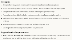

fig 2.20 - 2.21 Product Page Feedback (Claude AI)
General
- Gallery Indicator for Product Images: Show how many images are available and highlight the current image being viewed.
- Make Ratings More Prominent: Emphasize the 4.0/5 rating score, as reviews heavily influence purchase decisions.
- Quick-View Product Specifications: Add a brief specs summary (e.g., wattage, weight, key features) at the top for faster reference.
- Tabbed Navigation for Lower Sections: Implement tabs for "REVIEWS," "SPECIFICATIONS," etc., to help users quickly jump between sections.
- Enhance S-Coin Cashback Highlight: Design the cashback/S-Coin information to stand out more clearly on the page.
- Add a Product Highlights Summary: Include a bulleted list of 3–4 key selling points for quick understanding of the product's value.
Product Selecting Page

Product Selecting Page Feedback From Claude AI


fig 2.23 - 2.24 Product Selecting Page Feedback (Claude AI)
General
- Add "Add to Cart" Option: Allow users to add items to the cart instead of only offering "BUY NOW," supporting continued shopping.
- Show Updated Price Based on Selections: Automatically update and display the final price after users select their preferred options.
- Color Names with Visual Swatches: Add color swatches next to names like "Silver Blue" to help users easily recognize colors.
- Visual Stock Indicators: Show low stock or unavailable options visually (e.g., grayed out, warning tag).
- Enhance Expandable Product Image: Make the image expand icon more visible to encourage users to view larger product images.
Payment Page

Payment Page Feedback From Claude AI


fig 2.26 - 2.27 Payment Page Feedback (Claude AI)
General
- Payment method selection: The radio buttons for payment methods are placed far from their labels, making the connection less clear. Consider redesigning this section for better alignment.
- Address selection: It's not immediately obvious that the address section is tappable to change. Consider adding an "Edit" or "Change" label.
- Voucher and Remarks sections: These expandable sections don't clearly indicate what happens when tapped. Add a hint about their function.
Successful Payment Page

Successful Payment Page Feedback From Claude AI


fig 2.29 - 2.30 Successful Page Feedback (Claude AI)
General
- Add Order Details: Display essential purchase info like order number, product name, and total paid for user reassurance.
- Navigation Options: Include buttons such as View Order, Continue Shopping, and Back to Home to guide users on what to do next.
- Sharing Capabilities: Allow users to share their purchase on social media or send the receipt to their email for convenience.
- Completion Animation: Use a subtle checkmark animation to enhance satisfaction and create a sense of completion.
- Contact Information: Provide customer service details for quick assistance in case of any issues.
- Loyalty Rewards Display: Show S-coins or points earned to reinforce user engagement with the rewards program.

- Font Size Inconsistency & Small Text: There were many inconsistencies in font sizes, and the body text was often too small, making it difficult to read.
- Cramped Layout & Poor Use of Proximity: The interface felt tight and unstructured due to limited margins and inconsistent spacing between elements.
- Weak Visual Contrast: Important content and action buttons lacked emphasis, making it difficult for users to identify key actions quickly.
- Dull Color Palette: The original dark red used in the design felt dull and heavy, failing to reflect the brand’s energetic and modern image.
- Inconsistent Visual Style: UI components had varying corner radii, leading to a mismatched and less cohesive visual style.

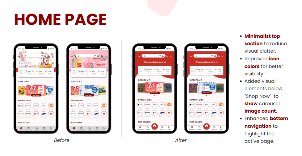
Here are the redesign solutions for the Senheng App, which are applied across most pages to enhance the overall user experience.

I have outlined the font sizes in the current redesign and simplified the text styles from 8 levels down to 5 to ensure greater consistency.

The margin width was increased from 26 to 30 at left and right side, so I adjusted and repositioned all layout elements accordingly.

For the bottom navigation bar, I changed the previous low-emphasis style (aligned to the left) to a more prominent one (aligned to the right). The currently active page is now highlighted with a larger icon inside a red circle for better visibility. For the center icon, I considered using the letter "S" (for Senheng) to represent the home page but ultimately chose a home icon instead, as it’s more universally recognizable and user-friendly.

I changed the color palette from dark red tones to lighter red tones, as the darker shades appeared dull and heavy. The lighter red brings more vibrancy and better reflects the energetic and modern image of the Senheng brand.


Figma File
Click here to view the task 1 Presentation Video in YouTube.
Specific Feedback: Mr.Razif mentioned that icons should be more intuitive and clearly indicate that they are clickable. Spacing and margins on mobile are too tight and need better padding for readability. Text capitalization should be consistent throughout the app.
Comments
Post a Comment