4.4.2023 - 2.5.2023 ( Week 1 - Week 5)
Gam Jze Shin / 0353154
Typography / Bachelor of Design (Hons) in Creative Media
Task 1 ( Exercise)
Index
1. Lectures
2. Instructions
3. Feedback
4. Reflection
5. Further Reading
LECTURESWeek 1 - Introduction
At the first week, Mr. Vinod had provide us the Module Information Booklet and Lecture Playlist. Hence, we can better understand about this module and also the timeline of this module during this semester. In the first lecture playlist, Mr. Vinod talked about the basic of typography.
fig. 1.1 Own notes for introduction
Week 1 - Eportfolio briefing
We need to create our own blog and include the information and work that we learned and done throughout this semester. Examples and guidelines have been given in the lecture playlist.
Week 1 - Eportfolio Jump link
From this video, I learned about how to use to 'jump link' inside a blog.
Steps:
1. Prepare your blog
2. Add the HTML code: <span id="NAME"></span>
3. Copy Permalink
4. Add the Permalink + #
Week 2 - Development
fig. 1.2.1 Own notes for development
fig. 1.2.2 Own notes for development
fig. 1.2.3 Own notes for development
fig. 1.2.4 Own notes for development
Week 2 - Basic
fig. 1.3.1 Own notes for basic
fig. 1.3.2 Own notes for basic
fig. 1.3.3 Own notes for basic
fig. 1.3.4 Own notes for basic
Week 2 - Ex_ Type Expression Words
Lecturer had showed how to arrange the words by using some tools. Besides, there are a lot of shortcut key that we can know to make our working progress more easier.
fig. 1.2 Shortcut key I learned
Week 3 - Text (Part 1)
fig. 1.4.1 Own notes for text
fig. 1.4.2 Own notes for text
fig. 1.4.3 Own notes for text
fig. 1.4.4 Own notes for text
Week 3 - Text (Part 2)
Mr. Vinod helped us do revision on the previous lecture so we could recover our memory and have a better understanding of the next typography's information.
fig. 1.5.1 Own notes for text
fig. 1.5.2 Own notes for text
fig. 1.5.3 Own notes for text
fig. 1.5.4 Own notes for text
Week 3 - Type Expression Animation (Basic)
In the video, lecturer had taught about how to create animation by using Adobe Illustrator and Adobe Photoshop.
fig. 1.6 Steps for animation
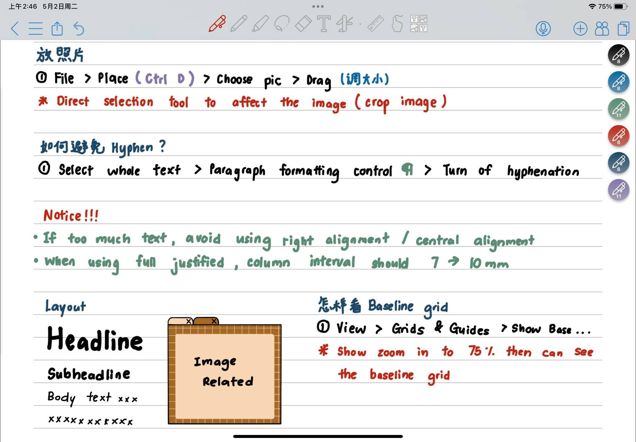
Week 4 - Understanding
fig. 1.7.1 Own notes for text
fig. 1.7.2 Own notes for text
Week 4 - Screen & Print
fig. 1.8.1 Own notes for text
fig. 1.8.2 Own notes for text
From the videos, it expands my understanding of information hierarchy and spatial organisation, as well as my familiarity and skill with the required applications ( InDesign).
fig. 1.9.1 My own notes for exercise 2
fig. 1.9.2 My own notes for exercise 2
fig. 1.9.3 My own notes for exercise 2
INSTRUCTIONS
Task 1: Exercise 1- Type Expression
We had been given 7 word to create type expression which is rain, fire, crush, water, dissipate, freedom and sick. After that, sketching out the ideas. The words I choose are Rain, Fire, Freedom and Sick.
Sketches
 fig. 2.1 Type expression sketches (Week 2, 11.4.2023)
I showed my progress to Mr. Vinod in class.
 fig. 2.2.1 Type expression sketches (Week 3, 18.4.2023)
Final Type Expressions
Based on Mr. Vinod's feedback, I had changed my progress.
 fig. 2.2.2 Type expression sketches (Week 3, 23.4.2023)
fig. 2.2.3 Final Type Expressions- PDF (Week 3, 23.4.2023)
Type expression animation
We should create an animation for our designed of type expression word. After viewing Mr. Vinod's lecture playlist, I tried to animate two words by using Adobe Illustrator and Adobe Photoshop which is 'Rain' and 'Sick‘.
fig. 2.3.1 Progress screenshot in Adobe Illustrator (Week 4, 24.4.2023)
fig. 2.3.2 Progress screenshot in Adobe Photoshop(Week 4, 24.4.2023)
fig. 2.3.3 Animation- Rain (Week 4, 24.4,2023)
fig. 2.3.4 Animation- Sick (Week 4, 24.4,2023)
Final animated Type Expression
After showing my animated type expression to Mr. Vinod, he thinks that the word 'SICK' did not work compared to the word 'RAIN'. Hence, he suggested me to improve the word 'RAIN'. I make some changes for my animated type expression in class.
fig. 2.3.5 Final animation- Rain (Week 4, 25.4,2023)
Task 1: Exercise 2- Text Formatting
For exercise 2, we will receive little chunks of text that cover various aspects of text formatting, such as typeface selection, type size, leading, line length, and paragraph spacing, forced-line-break, alignment, kerning, widows, orphans and cross-alignment.
fig. 2.4.1 Fonts we can used
fig. 2.4.2 Exercise on Lecture (Week 4, 30.4.2023)
Text Formatting
After going through the lecture playlist of text formatting 1:4- 4:4A, I try to do my layout by using InDesign. It is a bit challenging to me as I am not familiar with the tool. I had showed my work to Mr. Vinod on week 6 and ask him about my image used in the layout. He suggested me to use the image which at fig2.5.3 Layout #3 as it is more related compared with the image which at fig2.5.1 Layout #1 and fig2.5.2 Layout #2.
fig. 2.5.1 Layout# 1(Week 5, 1.5.2023)

fig. 2.5.2 Layout# 2(Week 5, 1.5.2023)
fig. 2.5.3 Layout# 3 (Week 5, 5.5.2023)
Final Text Formatting
Details:
HEAD
Typeface: Futura Std
Fonts: Bold
Type size: 60pt
Leading: 26pt
BODY
Typeface: Futura Std
Fonts: Book
Type size: 11pt (+-0.5pt for adjustment)
Leading: 13pt
Paragraph spacing: 1p1
Characters per-line: 59
Alignment: Left justified
CAPTIONS
Typeface: Janson Text LT Std
Fonts: Roman
Type size: 7pt
Leading: 7pt
SETTINGS
Margins: 12.7mm top, bottom, left, right
Columns: 2
Gutter: 7mm

fig. 2.5.4 Final Layout (Week 5, 5.5.2023)
fig. 2.5.5 Final Layout - PDF (Week 5, 5.5.2023)
fig. 2.5.6 Final Layout with grids (Week 5, 5.5.2023)
fig. 2.5.7 Final Layout with grids - PDF (Week 5, 5.5.2023)
FEEDBACK
Week 2
General Feedback: Sketches could not be too graphical. Make it easy to be understand by others via the word directly. Do not use the fonts given to sketch it first. Do after the sketches done and try to restore it by using fonts.
Specific Feedback: The word 'Rain' could not include the umbrella but can be replace by the letters 'R' .
Week 3
General Feedback: Eportfolio should be updated follow by the timeline. Should use the space well to determine the size of word.
Specific Feedback: Avoid to include graphical element on 'fire'. Do not distorted too much for the words.
Week 4
General Feedback: Emphasis on the word and brings out the feelings of the word. Based on our own ideas to decide the seconds of the last frame.
Specific Feedback: Continue with 'Rain' word. The process of absorbing water from clouds should be changed to raining and the water droplet fill up the lower part of 'i'.
Week 5
TEXT FORMATTING
1. Is kerning and tracking appropriately done?
2. Does the font size correspond to the line-length, leading & paragraph spacing
3. Is the alignment choice conducive to reading?
4. Has the ragging been controlled well?
5. Has cross-alignment been established using base-line grids?
6. Are widows and orphans present?
General Feedback: If using justified align, space between need to between 5-7mm. Use regular typeface as condensed typeface will reduce readability. Specific Feedback: Image using should related to the text. Column interval should have 5 to 7mm.
REFLECTION
Experiences
In this task, I have learned some skills on how to use Adobe Illustrator, Adobe Photoshop and Adobe InDesign. At first, we should express word by using Adobe Illustrator. It is very challenging to me as we cannot use graphical element to express the word. Besides, I learned how to use Adobe Photoshop to create animation. It is a very useful skills for me. In InDesign, I gained knowledge about using tools to create text formatting. From this assignment, I had create a lot of works. Mr. Vinod had gave me many feedback on my work and I learned from it. Not only that, lecture playlist and my further reading also helped me a lot in this assignment.
Observations
I observed that doing typography will spend a lot of time on it if you are not familiar with the tools. However, constantly trying is the key to the success of the designer. Thus, we should not afraid of trying but we should try bravely. Even if it has mistake, it does not matter, at least we can learn from the mistake. Besides, typography plays an important role for design as it can bring better visual experience to the viewer.
Findings
I noticed that typography is not an easy subject. It contains a lot of skills and rules that should apply in our work. The seemingly simple things contain a variety of meanings, technical inside. This is even more complicated than I imagined. However, after I study about the knowledge of typography, I feel that as long as we practice more and master our skills, we can make satisfactory works in short time.
FURTHER READING
fig. 5.1 Design School: Type : A Practical Guide for
Students and Designers.
There are some recommended readings in Modules Information Booklet. I am attracted by the title of this book. Thus, I decided to do some research on it.
Reference: Pouline, R. (2017)
Design School: Type : A Practical Guide for
Students and Designers.
Beverly, MA : Rockport Publishers.
Chapter 1: Type Classification
fig. 5.2.1 Information of the book
Chapter 2: Terminology
fig. 5.2.2 Information of the book
Chapter 3: Character and Glyphs
fig. 5.2.3 Information of the book


Comments
Post a Comment