.jpg)
22.4.2024 - 2.8.2024 ( Week 1- Week 14)
Gam Jze Shin / 0353154
Minor Project / Bachelor of Design in Creative Media
Minor Project / Bachelor of Design in Creative Media
G1: Basic T
Index
1. Instructions
2. G1: Basic T
3. Feedback
4. Reflection
G1_Basic T
Project Important Link
Project Brief
In the first week, Mr. Mike held a project briefing where he introduced all the available projects, allowing us to choose one at random. He suggested that we select a project topic that interests us.
In the first week, Mr. Mike held a project briefing where he introduced all the available projects, allowing us to choose one at random. He suggested that we select a project topic that interests us.
Group Member
This is our group members and we decided to choose the first topic, which is Basic T.
This is our group members and we decided to choose the first topic, which is Basic T.
- Liew Xiao Hui
- Ting Wen Yi, Bernice
- Janice Tan Wan Xuen
- Tan Jie ying
- Sim Jian Xiong
Searching Progress
When we know on our topics, we began by researching functional T-shirts, particularly focusing on anti-slash T-shirts available in the market.
When we know on our topics, we began by researching functional T-shirts, particularly focusing on anti-slash T-shirts available in the market.

fig 1.1 Miro Board
Each of us has our own board in Miro where we can
place the information we find. This allows our group
members to view our research outcomes from there.

fig 1.2 Focus products
After conducting research, we decided to focus on
two functional T-shirts: anti-slash and
hydrophobic T-shirts.
Survey
The next step is to prepare two survey forms, one
for the anti-slash T-shirt and another for the
hydrophobic T-shirt to help identify our target
audience.

fig 1.3 Survey Questions
I prepared the interview survey questions for
anti-slash T-shirts based on the empathy map. I
realized that the questions and options needed to
be carefully crafted to effectively identify our
target audience.
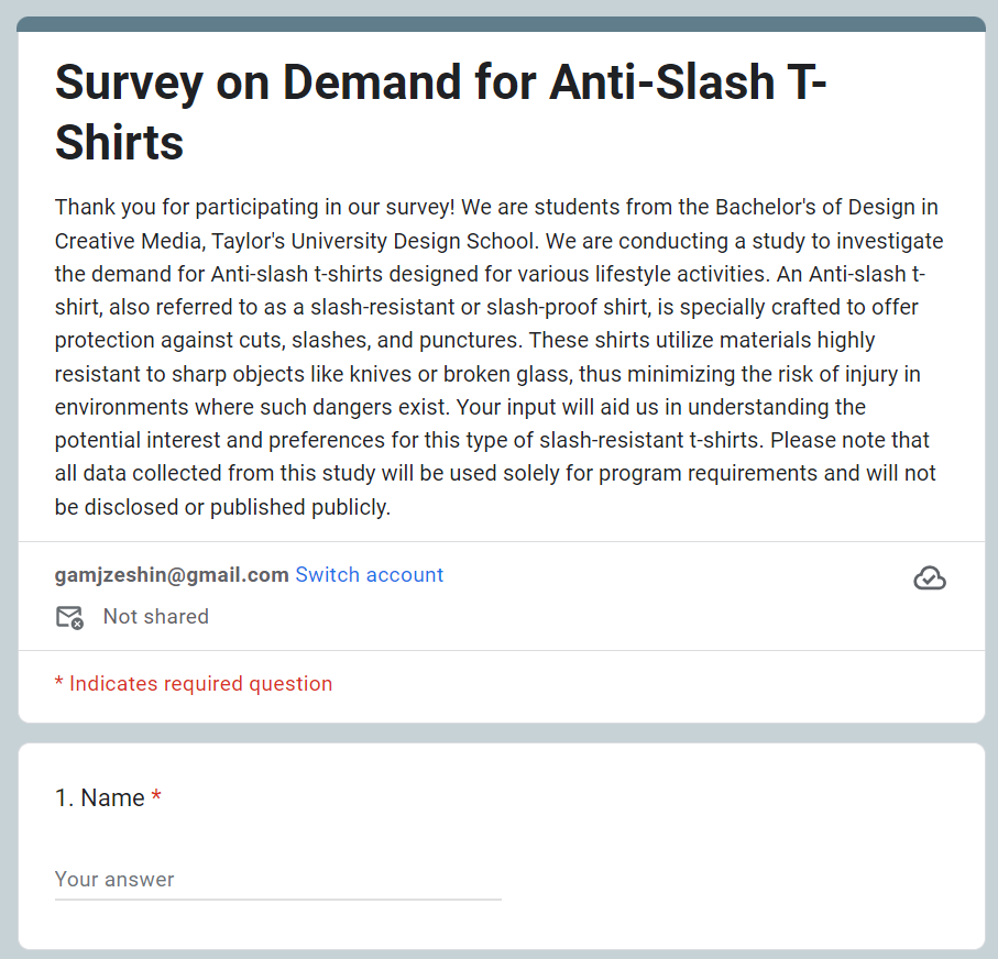

fig 1.4 - 1.5 Survey Form
Anti-Slash T-Shirts Survey LinkHydrophobic T-Shirts
However, while we were collecting our data, the client decided to switch from the hydrophobic T-shirt to an anti-radiation T-shirt due to its higher market potential. As a result, our hydrophobic survey became unusable. This was disappointing for us, and we had to start our research over again, focusing on the anti-radiation shirt.
Interview

fig 1.6 Interview person list
To gather enough data, we also conducted interview sessions. For the anti-slash T-shirt, we interviewed three people, and for the anti-radiation T-shirt, we interviewed five. Each group member was responsible for interviewing at least one person.

fig 1.7 Recording for interview session
I recorded the interview sessions and documented
all the answers provided by the
interviewees.
Empathy Map

fig 1.8 Empathy Map

fig 1.9 Own note list for empathy map
I reviewed the map and wrote down my ideas before the meeting to save time. This way, we could directly discuss and refine our thoughts during the meeting instead of thinking of ideas on the spot.

fig 1.10 User Content
Next, we completed our user personas, user journey map, and customer journey map based on our target audience.
Brand Concept
In this stage, we should think on our brand
concept such as brand name, tagline, mood
board and logo.

fig 1.11 Brand name version 1
We chose the name "BasicDefend" because
"Basic" reflects the simplicity and essential
nature of the t-shirts, while "Defend"
emphasizes their protective qualities, such as
anti-radiation or anti-slash properties.

fig 1.12 Brand name voting

fig 1.13 Logo ideation
Additionally, we faced challenges with our logo design. We wanted to incorporate a shield shape to represent protection, while also including elements of a shirt to clearly convey that we are a clothing brand focused on safety.

fig 1.14 Color Palatte
We chose this color palette to give a more
professional look. Since we primarily focus on
adult males, the use of dark blue, grey, and white
reflects a modern and serious style.
Key Visual
Before creating all the content, we established a
marketing strategy calendar to serve as our
guideline.
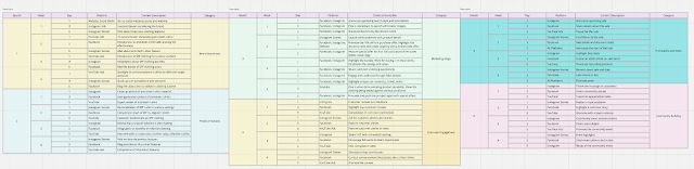
fig 1.15 Marketing strategy calendar
Based on our marketing strategy calendar, the
content included will be:
- Social Media Ads
- YouTube Ads
- Instagram Story
- Instagram Post
- CozyProtec Websites

fig 1.16 Art Concept
Since our outcomes lacked consistency, we revisited the concept to ensure that everyone followed it, aiming for a more cohesive result.
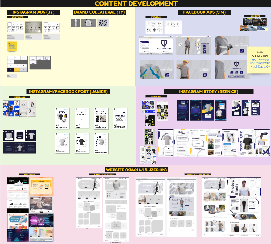
fig 1.17 Content Development
We repeatedly adjusted our content to achieve
consistency and ensure a perfect outcome that
aligns with our brand name and concept. This
process involved collaborative content development
among all team members.

fig 1.18 Website Progress in Figma
My task is designing the websites with
XiaoHui. We design the prototype by using
Figma. Click
here
to view the website progress file.

fig 1.19 Key elements used
We identified several key elements suitable for the website to align with the agreed-upon key visuals.

fig 1.20 CozyProtec Prototype
After completing the website design and linking all the pages together, I felt happy and satisfied seeing the consistent outcome. Despite the many challenges we faced, resolving them made the final result worthwhile.
Final Outcome
Social Media Ads
fig 1.21 Social Media Ads - YouTube
YouTube Ads
fig 1.22 YouTube Ads - YouTube
Instagram Stories

fig 1.23 Instagram Stories
Social Media Post

fig 1.24 Social Media Posts
Packaging

fig 1.25 Packaging Design
Brand Collateral (Drawstring Bag)

fig 1.26 Brand Collateral - Drawstring Bag
Brand Collateral (Bottle)

fig 1.27 Brand Collateral - Bottle
Brand Collateral (Towel)
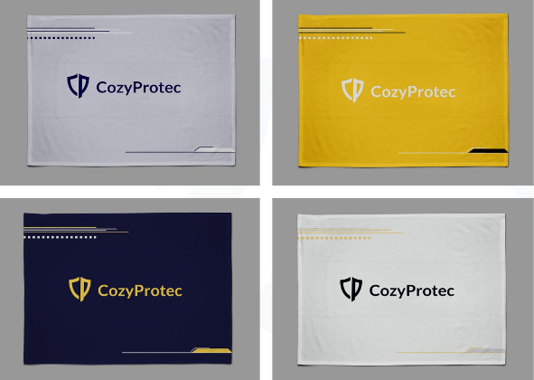
fig 1.28 Brand Collateral - Towel
Websites
fig 1.29 Cozy Protec Websites- Figma
Feedback
Reflection
During this project, I had the opportunity to choose from various topics and eventually selected "Basic T." I faced challenges in identifying the target audience, conducting interviews, and adapting to sudden changes in product focus, such as switching from hydrophobic to anti-radiation shirts with my group members. Throughout, we worked diligently on refining the research, design, and presentation materials. Despite occasional setbacks and disagreements within the group, I managed to complete my tasks by collaborating and assisting others. During this period, I was happy to work with my supportive group members. I believe that my interpersonal skills (TGC 5) have improved, and I now understand team dynamics and the power of teamwork. The experience was both challenging and educational, as I learned to adapt and improve my work based on continuous feedback.
Observation
I observed several key issues and areas for improvement during the project. Initially, the designs lacked consistency, and the target audience research was unclear. I struggled with integrating feedback into my work and aligning my design style with others. Therefore, I realized that we should discuss and identify the key visuals that everyone agrees on before we all start designing our work. Additionally, our presentation initially had too much text, and the slides lacked visual appeal. This taught me that when presenting, we should focus more on graphic elements and keywords to leave a lasting impression on the client and others, rather than using too many words, which can dampen enthusiasm. Furthermore, our team faced difficulties in keeping up with deadlines and ensuring that everyone contributed equally, as not everyone could keep up with the pace. However, through regular discussions, brainstorming sessions, and consultations with our lecturer, we gradually improved our designs and presentations, ultimately achieving a cohesive and polished final product.
I observed several key issues and areas for improvement during the project. Initially, the designs lacked consistency, and the target audience research was unclear. I struggled with integrating feedback into my work and aligning my design style with others. Therefore, I realized that we should discuss and identify the key visuals that everyone agrees on before we all start designing our work. Additionally, our presentation initially had too much text, and the slides lacked visual appeal. This taught me that when presenting, we should focus more on graphic elements and keywords to leave a lasting impression on the client and others, rather than using too many words, which can dampen enthusiasm. Furthermore, our team faced difficulties in keeping up with deadlines and ensuring that everyone contributed equally, as not everyone could keep up with the pace. However, through regular discussions, brainstorming sessions, and consultations with our lecturer, we gradually improved our designs and presentations, ultimately achieving a cohesive and polished final product.
Findings
I discovered the importance of clear communication, collaboration, and adaptability in project work. Feedback from the lecturer and client was crucial in guiding our design direction and ensuring our work met professional standards. I learned to prioritize visual appeal in presentations, focus on user-friendly design elements, and ensure consistency across all design materials. Additionally, I found that incorporating a unified design style and color scheme significantly improved the overall look and feel of the project. The project also highlighted the importance of effective time management and the willingness to help others meet deadlines. My communication skills have also improved through this module, as I needed to effectively communicate my ideas to my group members.
I discovered the importance of clear communication, collaboration, and adaptability in project work. Feedback from the lecturer and client was crucial in guiding our design direction and ensuring our work met professional standards. I learned to prioritize visual appeal in presentations, focus on user-friendly design elements, and ensure consistency across all design materials. Additionally, I found that incorporating a unified design style and color scheme significantly improved the overall look and feel of the project. The project also highlighted the importance of effective time management and the willingness to help others meet deadlines. My communication skills have also improved through this module, as I needed to effectively communicate my ideas to my group members.
Comments
Post a Comment