Application Design - Final Project: Completed Mobile Application Design Prototype

15.7.2024 - 5.8.2024 ( Week 12- Week 14)
Gam Jze Shin / 0353154
Application Design / Bachelor of Design in Creative Media
Final Project: Completed Mobile Application Design Prototype


Index

1. Instructions
2. Final Project
3. Feedback
4. Reflection


Instructions


Final Project

In this project, students will synthesize the knowledge gained in task 1, 2 and 3 for application in task 4. Students will create integrate visual asset and refine the prototype into a complete working and functional product experience for a selected task.

Color Palette
The main color that I used for Senheng app is red.

fig 1.1 Color chose

The darker red will be used for title layering and some button colors to differentiate them from other information. The medium red will highlight selected information and important details, such as notifications that contain messages. The lighter red will be applied to icons, like the voucher icon, to draw the viewer's attention.


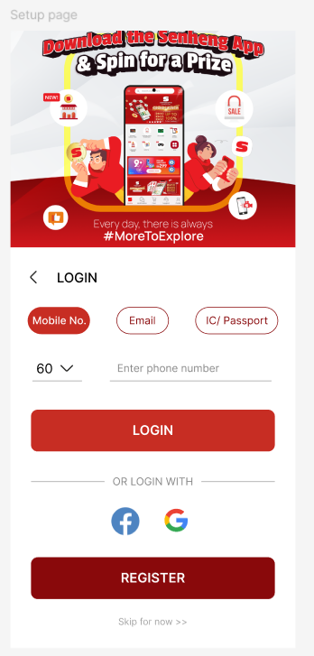
fig 1.2 - 1.3 Comparison of low and high fidelity

The comparison between the low-fidelity prototype, which did not include color, and the high-fidelity prototype, which incorporates color.

fig 1.4 Home page poster showing

For the Senheng app posters, I primarily chose pink, red, and yellow to maintain consistency with the app's theme colors. This approach enhances visual coherence and provides a more comfortable experience for viewers.

fig 1.5 Color functions

The selected part will use the color #C72D23 red to make it easier for viewers to see and distinguish the selected information. The upper section will primarily use the darker red, #89090B, to create a clear separation and highlight different layers.

Improvement 
Based on the feedback collected from Project 3, I made several improvements to the Senheng app design.

fig 1.6 - 1.7 Improvement of ad layout

For the ad section background, I used the homepage instead of a plain white background to avoid confusing users.

fig 1.8 Shadow effects

The above section shows the design before, and the section below shows it after. I added shadow effects to make the section more distinct and easier for viewers to understand as a separate part.

fig 1.9 Shadow effects

Another example of adding shadow effects is shown here. The left side displays the design before adding shadows, while the right side shows the design after the shadows have been applied. Adding shadow effects gives the section a framed appearance, making it stand out more and providing a clearer visual distinction. This enhancement helps users better perceive the separation between different elements.

fig 1.10 Additional page

This page introduces a new feature compared to the low-fidelity wireframe: a notification will appear to confirm that an item has been successfully added to the cart after the "Add to Cart" button is clicked. This addition improves user feedback and helps prevent confusion by clearly indicating that the action has been completed. It enhances the overall user experience by providing immediate, visible confirmation of their action.


Final Outcome

Click here to view the walkthrough video of high-fi Senheng app design prototype in YouTube.

fig 1.11 Final High Fidelity Walkthrough video - YouTube

Click here to view the Final Low Fidelity Wireframe in Figma.

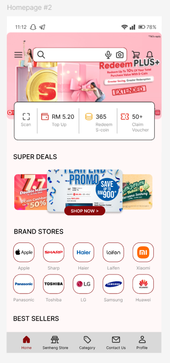
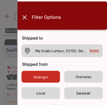
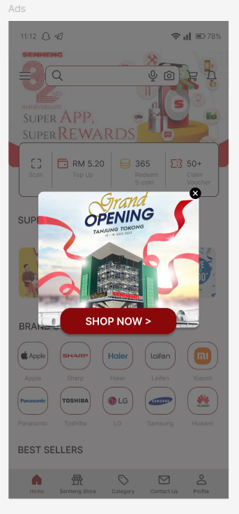
fig 1.12 - 1.13 Final High Fidelity Wireframe - Figma


Feedback

Week 14
Specific Feedback: Continuing with the high-fidelity wireframe, there are some bugs and confusion with the page linking that need to be resolved. Additionally, the ad page should appear on the home page rather than having a white background.


Reflection

Final Project
For this final project, I need to create a high-fidelity wireframe for the chosen app, incorporating feedback and improvements from the low-fidelity prototype to refine it. I will combine all elements from Project 1 through Project 3 to develop a complete mobile application design prototype. Throughout this module, I have gained extensive knowledge in UI/UX design. Although I had used Figma before, this is the first time I have linked all the prototypes together in Figma to create a functional app.

Designing a mobile application involves numerous rules and principles. This module has enhanced my understanding of how to make an app more user-friendly. For an e-commerce application, it's crucial to consider strategic layout arrangements to increase user interest in purchasing products, rather than focusing solely on aesthetic aspects. Creating an effective UI/UX layout is challenging, but with each attempt, the outcome improves.

Comments