Information Design - Project 1: Instructable Infographics poster


19.2.2024 - 27.2.2024 ( Week 3- Week 4)
Gam Jze Shin / 0353154
Information Design / Bachelor of Design in Creative Media
Project 1: Instructable infographic poster


Index

1. Instructions
4. Reflection


Instructions


Project 1

An infographic poster for ONE recipe selected from Pasta Grannies. Study one video, break down, and chunk the preparation and cooking process into an instructable poster. Try to capture each Grandma’s personality and unique dish identity in your poster as part of the narrative structure.

Because “A picture is worth a thousand words”. Yours should reflect the following: 
  • To transmit or communicate a message. 
  • To present large amounts of information in a compact and easy-to-understand way. 
  • To reveal the data. Discovering cause-effect relations, knowing what’s happening. 
  • To periodically monitor the evolution of certain parameters. 
You will develop an infographic to communicate a concept, topic, or idea - IN THIS CASE A COMPLETE SET INSTRUCTION TO A RECIPE. 
The infographic should take viewers visually through the information you want them to learn or know. Based on your infographic the audience should be able to learn through viewing and interpreting the various graphical information and text. 

Theoretical (Information Design Framework) 
  • Information type 
  • Device 
  • Principles (LATCH etc) 
  • Aesthetics i.e: isometric, simplified illustrations
Requirement: 
  • You will need to reflect the following (assessment criteria): Practical - photo editing/illustration software
  • Graphs, charts, and diagrams
  • Poster size: 1240 × 1750 pixels or 2048 × 2048 pixels

Data Option
First, I need to select an recipe from Pasta Grannies. After watching some videos on the Pasta Grannies channel, I noticed that certain videos did not have subtitles. Therefore, I decided to choose a video that includes subtitles, as it will make it easier for me to record all the steps. The recipe that I selected is sweet poppyseed fritters called Casincí:

fig 1.1  Recipe selected

I listed the required ingredients and documented all the steps from the video on Canva slides. This process helps me form a preliminary understanding of the information, providing a crucial foundation for the next steps.

 
fig 1.2 - 1.3 Information needed in poster

Research
Then, I use keywords such as 'process,' 'recipe,' and 'infographic' to search on Pinterest for visual references and gather ideas.

fig 1.4 Visual References in Pinterest

I noticed that the majority of posters use a portrait layout with the main object placed in the center. The process is typically shown from top to bottom, accompanied by descriptions on both sides.

Progress
Sketches
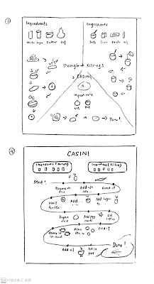
Next, I 
I generated some ideas and started sketching them in a book. You can see four sketches below. The size of poster I decided is in square which is 2048 x 2048 pixels. This is because by using the Miller's Law, I would like to separate the steps into 3 chunks.
fig 1.5 - 1.6 My own sketches

I presented and explained my ideas to Mr. Shamsul during the Week 3 class. He expressed that Sketch 3 is preferable visually as it is divided into three parts, making it easier for viewers to understand and recognize.

Digitalize
I continued working on my poster using Adobe Illustrator. Here is the evidence that illustrates my creative process.
fig 1.7 Digitalize process

Before including every information, I found a suitable font for my poster and download it on https://www.1001fonts.com/search.html?search=chocolate+bar+demo.

fig 1.8 - 1.9 Font download

The initial font I downloaded is [Chocolate Bar Demo] because of its round and cute appearance. It perfectly complements my poster style, evoking a dessert-like feel that aligns well with my recipe for sweet fritters. Hence, I would like to use it for my title. Besides, [Varela Round] font is used due to its Sans Serif style and rounded appearance.

fig 1.10 Images used

For the graphics, I discovered fitting illustrated images online and inserted them into Adobe Illustrator. Subsequently, I utilized the image trace function, tracing them in 16 colors, and then expanded the images.

fig 1.11 infographic information

After that, I placed all the information and graphics in the infographic poster according to my sketch 3 layout.

fig 1.12 Draft without background

I tried to incorporate all the ingredients and steps into my poster. Due to limited space, I omitted some unnecessary words or combined certain steps. This approach reduces the visual burden on the viewer and ensures the overall poster does not appear too complicated.

fig 1.13 Color scheme in poster

In this stage, I discovered a suitable color scheme on Color Hunt. I searched for tags related to food and decided to use a scheme that closely matches the colors of my recipe, creating a harmonious visual appeal.

fig 1.14 Draft without numbering

This is the result after I added the background color, following the color scheme references. I used distinct colors to differentiate various parts of the making process.

fig 1.15 Draft with simple title style

After showing the previous poster to my friends, they suggested adding numbers in front of the steps as they found it confusing without the numbering.

fig 1.16 Draft with texture background

I felt that the heading was not very obvious and a bit confusing in the previous draft. To address this, I attempted to enhance it by adding a frame using the Curvature tool in Adobe Illustrator. Additionally, I was unsure whether to include a textured background. Ultimately, I decided to keep it as I believed a plain color background would let the poster looking clean and uncluttered in the final outcome.

fig 1.17 Instructable Infographics poster attempt 01

In short, I opted to submit the Instructable poster without a textured background and with a clear title style in the Week 4 class. During the class, I received feedback from Mr. Shamsul, and I have decided to implement some changes and refine my poster to enhance its overall quality.

Refine Digitalize
fig 1.18 Instructable Infographics poster in portrait layout

After receiving feedback from Mr. Shamsul in the Week 4 class, I switched the poster from a square layout to a portrait layout. This adjustment allows for more space, addressing Mr. Shamsul's emphasis on the importance of white space in our posters. 

fig 1.19 Drawing the ingredients

As suggested, to draw the graphics ourselves, I decided to spend time drawing all the graphics featured in the poster. Initially, I outlined all the strokes using the pen tool, shape tools, and lines in Adobe Illustrator.

fig 1.20 Color scheme used

Before adding color to my drawings, I found a color scheme online. I opted for sharp and bright colors to enhance the attractiveness of my poster.

fig 1.21 After inserting color

These are all the graphics that I drew in Adobe Illustrator, and I have placed them into my Instructable Infographics poster.

Final Outcome 
fig 1.22 Final Instructable Infographics poster


Feedbacks

Week 3

General Feedback: The purpose of the infographic is to guide viewers visually through the information you want them to learn. By presenting graphical elements and concise text, the audience should be able to comprehend and interpret the content effectively.

Specific Feedback: Mr. Shamsul remind me that I should maintain a consistent graphic style throughout the poster.

Week 4

General Feedback: Add some texture on the background of poster if it looks plain.

Specific Feedback: The final outcome appears a bit complicated due to the abundance of information. The separating parts do not necessarily need to be in equal size. Mr. Shamsul recommended that I try a portrait size, specifically 1240 x 1750 pixels. He suggested making the ingredients part smaller and placing a greater focus on the steps. Remove the separate line as it is unnecessary.


Reflection

Project 1 
In this task, I felt happy and enjoyed the opportunity to choose a recipe and design it myself. I am satisfied with the outcome. I've learned that it's essential to assess which aspects of the topic, concept, or idea are crucial to convey or demonstrate. Then, I should consider the most effective way to represent each piece of information. For the poster we created, we need to ensure it is not complicated and that viewers can understand it. Therefore, using the chunking principle, adjusting font sizes, and employing different colors for various parts will enhance the visual effect, indicating what's most important and what the designer needs to convey. Besides, the more challenging aspect for me in this task is how to make good use of the space.

Comments