Exercise 1: Quantify &
Visualize Data
Quantify (count) your chosen items and arrange the
objects into a presentable layout or chart. Take a
picture and submit!
Requirements:
-
Information must be presented as is. You are
required to arrange the objects with relevant
indicators written out with pens to help you
visualize the quantity and data.
-
Take a picture of the final assembly and upload
into your e-portfolio and Google Classroom.
Data Option
In this exercise, we are required to select a single
item as our dataset. This item could be buttons,
candies, coins, M&M, or an Emergency Bug Out Bag.
The task involves sorting the chosen items
accordingly. Then, bring the selected items, along
with an A3 paper and marker pen to week 1 tutorial
class.
fig 1.1 Selected data option
The item I selected is M&M. I have bought three
different types of M&M: chocolate flavor, crispy
flavor, and peanut flavor, as the sizes vary between
them. Hence, in my data, it will have a variety of
data, including different sizes, flavors, colors,
and quantities.
Progress
Attempt 1
Before I started sorting and arranging my data, I
searched for visual references on Pinterest. I tried
to gather some ideas from there and noticed that there
are many ways to visually present data.
fig 1.2 - 1.3 Visual references
fig 1.4 M&M data graph visual
reference
First, I arranged the M&M by separating them with
different colors and flavors. Then, I placed them in a
manner similar to a bar chart. Mr. Shamsul suggested
that I can place them according to their color by
following the color system. (BROWN > RED >
ORANGE > YELLOW > GREEN > BLUE)
There are 5 Brown, 5 Red, 10 Orange, 9 Yellow, 6
Green, and 6 Blue M&M, making a total of 41. I
divided them into three parts based on different
flavors. It will make easier for me to visually
observe the data I have.
In this attempt, I applied a typographic system,
specifically a modular system, in the outcome. The
squares between them are nearly standardized and of
the same size vertically. I presented it to Mr.
Shamsul, and he mentioned that it is neat and easy to
understand. However, he suggested that it could be a
bit more creative as it appears somewhat simple.
Attempt 2
Then, I have an idea which is using Dilatational System and placed it at the middle of
the A3 paper. I found some references via
online.
fig 1.7 -1.8 Visual references of
dilatational chart
fig 1.9 - 1.10 Arrangement draft in week 1
class
I presented the draft of my second attempt to Mr.
Shamsul. He mentioned that it is more creative than
the previous one but appears complicated and
somewhat challenging to understand. Therefore, if I
choose to use this circular representation for
presenting my data, I should ensure it is easily
understandable.


fig 1.11 - 1.12 Draft and progress
I tried to brainstorm how to present my data in
a simpler and more easily understandable way by
sketching on paper. After that, I transferred
the concept to the A3 paper. In my dataset,
there are three circles with different radii.
The inner circle represents peanut flavor (L),
the middle circle represents crispy flavor (M),
and the outer circle represents chocolate flavor
(S). Additionally, I listed down the total in
the data.
Final Outcome
fig 1.13 Final Quantify & Visualize
Data
Location / Alphabet / Time / Category /
Hierarchy
Organize a group of information into a visual
poster that combines and utilizes the LATCH
principles (minimum 4)
Requirements:
-
Size resolution: 1240 × 1750 pixels or 2048 ×
2048 pixels
-
Use the digital photo editing/illustration
software available to assemble the Pokemon/
others into a LATCH infographic
poster.
-
You can re-use back the images of the
monsters/other elements but do create the rest
of your visuals to complete the poster.
Ideation
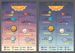
Before starting on this exercise, it is
essential to select a theme. I believe the Solar
System is an ideal choice based on the L.A.T.C.H
structure, as all the necessary information is
readily available.
fig 2.1 My own research based on
L.A.T.C.H
-
LOCATION: Based on
the positioning of planets in the Solar System
which is Sun, Mercury, Venus, Earth, Mars,
Jupiter, Saturn, Uranus and Neptune.
-
ALPHABET: -
-
TIME: Include the time it takes for
the planets to complete its orbit around the
Sun.
-
CATEGORY: Four terrestrial
planets (Mercury, Venus, Earth and Mars) ;
Two gas giants (Jupiter, Saturn) ; Two ice
giants (Uranus and Neptune).
-
HIERACHY: Contains the atmosphere
elements of the planets such as Oxygen,
Nitrogen, Hydrogen, Sodium, Helium, Carbon
Dioxide, Methane and other gases.
Research
I found some idea references on Pinterest related to
my chosen topic, the Solar System, before initiating
the sketching process.
fig 2.2 - 2.5 Visual references of Solar
System
I observed that many infographics related to
planets or the solar system incorporate the
concept of movement design, accompanied by the
depiction of each planet's location in the
universe. Besides, arrows prove to be effective
elements in such infographics, facilitating the
presentation and listing of information.
Progress
Sketches
Then, I sketched my initial ideas on paper,
exploring various layouts to determine the most
effective way to present all the gathered
information.
fig 2.6 - 2.7 My own sketches
After accepting suggestions from Mr.
Shamsul, I decided to proceed with the
sketches on the right before digitally
creating the infographic poster.
Digitalize
fig 2.8 - 2.10 Digitalize progress
Next, I started creating my digital sketch on
Adobe Illustrator. First, I searched online
for the images I needed, like planets and the
sun. I used the image trace function and
selected 16 colors for tracing. After that, I
listed all the information required for the
poster and chose the MV Boli font. I arranged
all the elements according to the sketch
layout, using line and arrow tools to separate
information. Finally, I added a background and
made slight adjustments to ensure the entire
poster looks simple, neat, balanced, and
appealing.
Final Outcome
fig 2.11 Final L.A.T.C.H infographic
poster
Feedbacks
Week 1
General Feedback: When sorting and arranging
the data by separating the
colors, we need to be mindful
of the color system, ensuring
that similar colors are placed
together. Try to find
references before thinking a
design.
Specific Feedback: Mr. Shamsul commented
that the first attempt is neat
but somewhat simplistic. While
it is easy to understand, he
suggested that it could be
improved with more creativity.
On the other hand, the second
attempt is more creative than
the previous one, but it poses
challenges in terms of
comprehension.
Week 2
General Feedback: Gathering and listing all
available data and information
is a crucial initial step before
contemplating design ideas. It
aids in understanding what
elements should be incorporated
into the design. Creating rough
sketches is also an essential
step in the design
process.
Specific Feedback: After presenting my
idea to Mr. Shamsul, he
expressed the opinion that the
layout in fig. 2.7 is better
than others. He suggested me
to use the arrow patterns in
Adobe Illustrator
strategically to elevate the
overall aesthetics of the
poster.
Exercise 1
Creating understandable data
is straightforward. However,
as a designer, the challenge
lies in generating data that
is both creative and
attractive while maintaining
clarity, as the lecturer
emphasized: Aesthetics are
crucial, but so is effective
information delivery!
Exercise 2
In this exercise, I've
learned the importance of
choosing a suitable type of
infographic for a specific
theme. It's crucial to be
mindful of the type used, as
it greatly influences how
easily viewers comprehend the
information presented in the
poster. Prioritizing
aesthetics without considering
the appropriateness of the
infographic type can result in
poor data delivery and
potential misunderstandings.
Additionally, incorporating at
least four principles based on
L.A.T.C.H poses a challenge.
While there's a wealth of
information to include in a
poster, the key is to ensure
it remains neat, easily
understandable, and avoids
unnecessary complexity.
.jpg)


.png)


Comments
Post a Comment