Advanced Typography - Task 2: Key Artwork & Collateral

20.9.2023 - 18.10.2023 ( Week 4- Week 8)
Gam Jze Shin / 0353154
Advanced Typography / Bachelor of Design (Hons) in Creative Media
Task 2: Key Artwork & Collateral


Index
1. Lectures
2. Instructions
3. Feedback
4. Reflection
5. Further Reading


Lectures

AdTypo_4_ Designing Type

Two reasons for designing a typeface by Xavier Dupré(2007):

  • Type design carries a social responsibility so one must continue to improve its legibility.
  • Type design is a form of artistic expression.
General process of type research:

fig 1.1.1 General process

Research 
  • It is essential to have a deep understanding of type history, type anatomy, and type conventions.
  • Familiarity with terminology such as side-bearing, metrics, and hinting is vital. 
  • Identifying the intended use and potential applications of the typeface is highly significant.
  • Analyzing existing fonts in use can provide valuable inspiration and serve as references.
fig 1.1.2 Research
Sketching 
  • Some designers opt for traditional methods, using brushes, pens, ink, and paper to sketch typefaces. These sketches are later scanned for digitization. 
  • Others prefer digital tools like Wacom tablets within font design software for faster and more consistent results, though this approach can sometimes limit the natural hand stroke movement. 
fig 1.1.3 Sketching
Digitization 
  • Software tools like FontLab and Glyphs App are commonly used for digitizing typefaces.
  • Designers may also utilize Adobe Illustrator to craft letterforms before importing them into specialized font applications. 
  • Attention should be given not only to the overall form but also to the counter form during this stage, as it significantly affects the typeface's readability. 
fig 1.1.4 Digitization

Testing 
  • Testing plays a pivotal role in refining the typeface and identifying areas that require improvement. 
  • Prototyping is a crucial part of the testing process, providing valuable feedback for enhancements. 
fig 1.1.5 Testing

Deploy
  • Even after deploying a finished typeface, unforeseen issues may arise that were not apparent during prototyping and testing. 
  • Therefore, the process of revision continues beyond deployment. 
  • Thorough and rigorous testing is essential to ensure that any emerging issues remain minor and manageable.
Typeface Construction:
fig 1.1.6 Typeface Construction

Constructing typefaces can be facilitated by using grids with circular forms, offering a simplified approach to crafting letterforms and serving as a potential method for designing letterforms.

Construction and consideration:

fig 1.1.7 Construction and consideration

An essential visual refinement includes extending curved shapes beyond both the baseline and cap line, aligning them vertically with straight elements. Another critical adjustment focuses on letter spacing, ensuring a consistent visual balance of white space between letters, a practice referred to as "type fitting."

AdTypo_5_ Perception And Organisation
Perception is the way in which something is regarded, understood, or interpreted.
In typography deals with visual navigation and interpretation of the reader via contrast, form and organisation of content. Content can be textual, visual, graphical or in the form of colour.

fig 2.1.1 Contrast

There are several methods in typography to create contrast. It helps to create distinction or differentiation between information.

fig 2.1.2 Sample of Contrast

Carl Dair add two more principles into the mix - texture and direction to make design work and meaning pop out, clearly and unambigously and with flair.

7 kinds of contrast:
1. Size

fig 2.2.1 Size

Provides a point to which the reader's attention is drawn. Big letter (Title/ Heading) bigger than body text.

2. Weight

fig 2.2.2 Weight

Describes how bold type can stand out the middle of lighter type of the same style. Using rules, spot, squares is also provide 'heavy area'.

3. Form

fig 2.2.3 Form

The distinction between a capital letter and its lowercase equivalent, roman letter/ italic variant, condensed/expanded are included under the contrast of form. Different style of typeface.

4. Structure

fig 2.2.4 Structure

Structure means the different letterforms of different kinds of typefaces. Monoline sans serif/traditional serif, italic/blackletter.

5. Texture

fig 2.2.5 Texture

Refers to the way the lines of type look as a whole up close and from a distance. This depends partly on the letterforms themselves and partly on how they're arranged.

6. Direction

fig 2.2.6 Direction

The opposite between vertical and horizontal, and angles in between. Turning one word on its side can have a dramatic effect on a layout.

7. Colour

fig 2.2.7 Colour

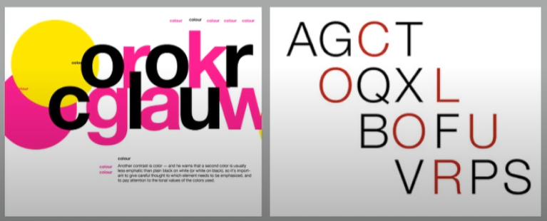
Suggested that second colour is often less emphatic in values than plain black/ white. It give thought to which element needs to be emphasized and to pay attention to the tonal values of the colours that are used.

fig 2.2.8 Comparison

Form

fig 2.3.1 Form

It is the part that plays a role in visual impact and first impressions. A good form in typography tends to be visually intriguing to the eye, it leads the eye from point to point, it entertains the mind and is most often memorable.

Originating from the Greek words "typos" (form) and "graphis"(writing), typography means to write in accordance with form.
Typography can be seen as having two functions:
1. to represent a concept
2. to do so in a visual form

Organisation/ Gestalt
Gestalt is a german word meaning the way a thing has been "placed" or "put together". Gestalt Psychology is an attempt to understand the laws behind the ability to acquire and maintain meaningful perceptions.

fig 2.4.1 Gestalt Principles

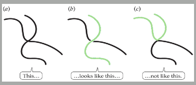
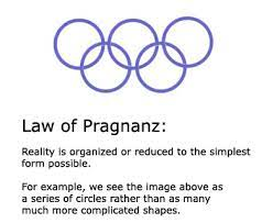
Gestalt psychologists, especially Max Wertheimer, developed a number of "laws" that predict how perceptual grouping occurs under a variety of circumstances.

Gestalt theory emphasizes that the whole of anything is greater than its parts-this is based on the idea that we experience things as unified whole.

fig 2.4.2 Gestalt Principles' explanation

Perceptual Organisation/ Groupings
1. Law of Similarity

fig 2.5.1 Law of Similarity

Elements that are similiar to each other tend to be perceived as a unified group. Similarity can refer to any number of features, including colour, orientation, size or indeed motion.

2. Law of Proximity

fig 2.5.2 Law of Proximity

Elements that are close together tend to be perceived as a unified group. This straightforward law states that items close to each other tend to be grouped together, whereas items further apart are less likely to be grouped together.

3. Law of Closure

fig 2.5.3 Law of Closure

The Law of Closure refers to the mind’s tendency to see complete figures or forms even if a picture is incomplete, partially hidden by other objects, or if part of the information needed to make a complete picture in our minds is missing.

4. Law of Continuation

fig 2.5.4 Law of Continuation

Law of (Good) Continuation holds that humans tend to perceive each of two or more objects as different, singular, and uninterrupted object even when they intersect. The alignment of the objects or forms plays a major role for this principle to take effect.

5. Law of Symmetry

fig 2.5.5 Law of Symmetry

The idea in the end, is to ensure awareness and inform your work process. Organisation of information in the form of laying out complex content in a hierarchical manner requires practice and the knowledge gained herein but also elsewhere. Knowledge obtained from reading, listening and viewing must be exercised or put to use for it to be retained and of standard.

6. Law of Simplicity (Praganz)

fig 2.5.6 Law of Praganz

The law of Pragnanz says humans prefer experience and stimuli that are simple and orderly. What's more, when we're faced with complexity, our brains will naturally simplify what we perceive. This means that to bring order to chaos, we'll do things like look for shapes in passing clouds.


Instructions


Task 2A: Key Artwork

For this task, we should design a key artwork which is also called wordmark. We will use our first name or pseudonym (minimum 4-5 letters) to design it and it must represent our characteristics. We should explore and compose as many permutations and combinations of our name in the form of a wordmark/lettering. The final key artwork must be an elegant solution, well balanced and composed, not complicated or confusing that leads to a functional and communicable key artwork.

Research

fig 3.1 My notes in Canva

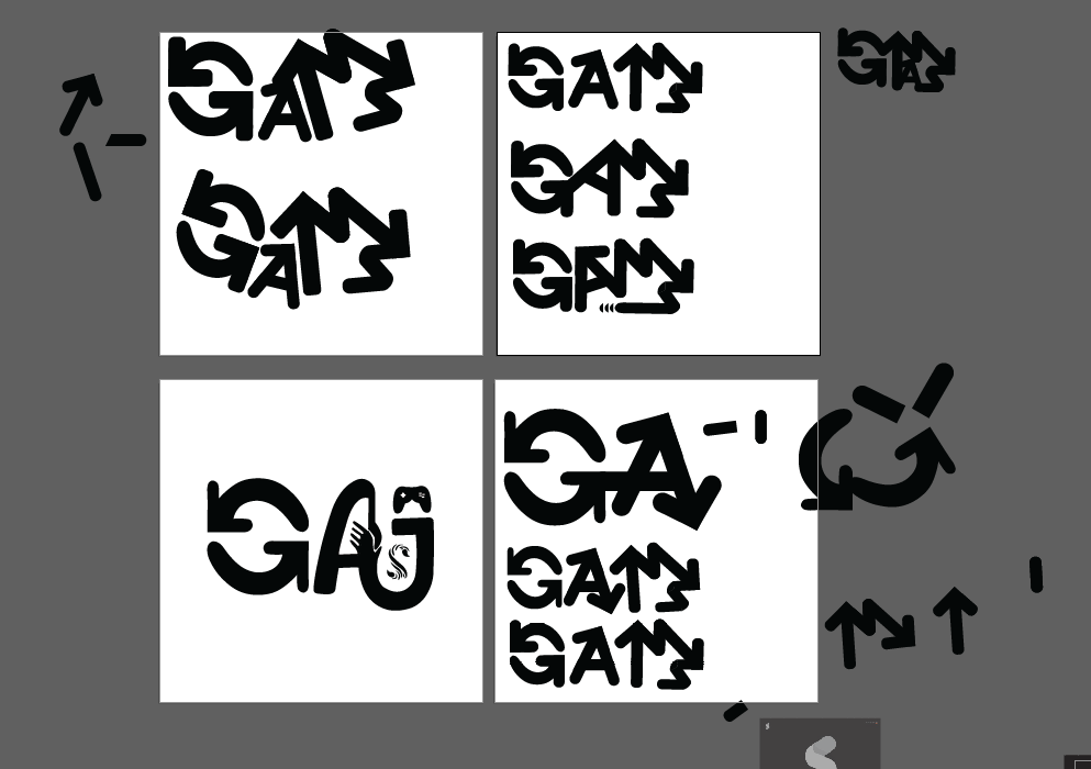
At first, I list down my characteristics and personality by using Canva. Then, based on it, I find some inspiration from Pinterest. From there, I can have a clearer ideas and directions of the way I want to design my key artwork in order to better characterize myself.


Sketches

fig 3.2 Sketching samples

After that, I tried to draw out my ideas roughly. At first, I decide to use 'GSHIN' for my key artwork. I made it as my Chinese name ‘芷’.


Digitalization
Attempt 01


fig 3.3.1 - 3.3.2 Digitization attempt 01 (Week 4, 19.9.2023)

After sketching my first idea, I digitalize it in Adobe Illustrator. I created ' GJSHIN' by using the building blocks style. Then, I tried to combine them together so that it looks like the word '芷’. However, I think it seems complicated and difficult to understand.

Attempt 02
fig 3.3.3 Digitization attempt 02  (Week 4, 20.9.2023)

In week 4 class, Mr. Vinod asked us to design key artwork for our name. At that moment, I would like to attempt on designing for a beverage brand. My ideas are using 'J' as a cup and 'G' as cup holder. Besides, a few of 'S' as drink symbol. Next is my other's ideas which looks like battery symbol (Symbolizes that I always maintain positive energy) and also the happy face.

Attempt 03

fig 3.3.4 Digitization attempt 03  (Week 4, 23.9.2023)

In this key artwork, I used the letters 'GMJS‘ to design like a game console. I used the shape of a scorpion tail to replace the wires of the game console.

Attempt 04

fig 3.3.5 Digitization attempt 04  (Week 4, 23.9.2023)

From attempt 4, I refine it by using similar concept. The new elements I added in are letter 'A' as a crown and also letter 'G' which made with two arrows.

Attempt 05
fig 3.3.6 Digitization attempt 05  (Week 4, 24.9.2023)

I think the previous attempts were looks like logos but not key artwork. Hence, I decided to take some ideas from the previous design and combine it together. The meaning of GAMJS
  • Letter 'G' - Two arrows (Cycle) symbolizes being entangled in numerous thoughts and activities.
  • Letter 'A' & J - Represent a helpful personality.
  • Letter 'M' - Reflects a love for playing games like Tetris and a perspective that life is akin to a game.
  • Letter 'S' - Signifies the Scorpio's tail, representing the individual's zodiac sign as a Scorpio.
fig 3.3.7 Printed key artwork  (Week 5, 27.9.2023)

In week 5 class, Mr. Vinod required us to place our key artwork at the center of a T-shirt by using Adobe Illustrator. Then, we need to use class's printer to print it out and present to Mr. Vinod.

Attempt 06

fig 3.3.8 Digitization attempt 06 (Week 5, 27.9.2023)

After I presented to Mr. Vinod, he suggested me to focus on one main element and apply it for my others letters in my key artwork. I made a decision based on his feedbacks which is remain the concept of letter 'G'.
fig 3.3.9 Digitization attempt 06 (Week 5, 27.9.2023)

I think the arrows of letter 'A' is too much. Therefore, I removed it and also make the stroke of letter 'G' more wider.


fig 3.3.10 - 3.3.11 Digitization attempt 06 (Week 5, 27.9.2023)

I had showed different samples of attempt 06 to Mr. Vinod. He thinks the second one looks more suitable. Besides, he told me that I can remain the style of using sharp and rounded point to accentuate my personality.

Final Key Artwork
fig 4.1 Final key artwork (Week 5, 28.9.2023)

fig 4.2 Final key artwork on T-shirt (Week 5, 28.9.2023)

Task 2B: Collateral
In this task, we need to design a T-shirt, lapel pin, an animated key artwork, and establishing an Instagram account to transform the key artwork into a brand. Initially, students will focus on the animated key artwork, refining the results before proceeding to create other collateral materials such as the t-shirt, lapel pin, and ultimately an Instagram account.

Colour Palette

fig 5.1 Colour Palette (Week 6, 2.10.2023)

At the beginning, I searched for the suitable four colour template on Colour Hunt as reference. During the process, I found that this colour template is in line with what Mr. Vinod said about which containing dark, light and bright colour.

Identify 3 collaterals

fig 5.2 Key artwork with different colour (Week 6, 2.10.2023)

After selecting my colour palette, I continue with applying it into my 3 collaterals. Before expand my key artwork on collaterals, I placed and inserted my key artwork with different colour on different colour background. 
This approach allows me to easily identify the most effective color combinations and arrangement of key artwork.

fig 5.3 Expand key artwork (Week 6, 2.10.2023)

Then, I tried to expand my artwork identity. I used the letter 'G' as the symbol of lemon. Lemon is one of my favourite fruits and it is also the name I often use in game.

T-shirt attempt 01

fig 5.4 T-shirt attempt 01 (Week 6, 3.10.2023)

For T-shirt, I just put my key artwork on it directly. Mr. Vinod advised us to do some expand on our key artwork. Besides, he also suggested me to apply different colour on different letters in order to make it easier to see what the letter is.

Bag attempt 01

fig 5.5 Bag attempt 01 (Week 6, 3.10.2023)

fig 5.6 Bag attempt 01 (Week 6, 3.10.2023)

fig 5.5 Bag attempt 07 (Week 6, 3.10.2023)

For bag, I tried with different style. The letter 'M' in my key artwork is not obvious. Thus, I think I should separate the letters by using different colour. Letter 'G' become the main character in my second design.

Keychain attempt 01

fig 5.8 Keychain attempt 01 (Week 6, 3.10.2023)

As I mentioned above, I expand the letter 'G' as lemon. Then, the other letters which is 'A', 'M' and 'S' are at the middle of 'G'.

Colour Palette

fig 5.9 Colour palette (Week 7, 9.10.2023)

When I showed my first chosen colour palette to my lecturer, Mr. Vinod, he thinks the green colour is a bit weird even it is still workable. I thought about it and finally decided to change the dark green to dark blue.

T-shirt attempt 02

fig 5.10 T-shirt attempt 02 (Week 7, 9.10.2023)

In second attempt, I separate the letters with different colour. The letters appear more prominent and are easily visible.

Bag attempt 02

fig 5.11 Bag attempt 02 (Week 7, 9.10.2023)

fig 5.12 Bag attempt 02 (Week 7, 12.10.2023)

I expand more on the key artwork which is using the circle and arrow elements. Then, I tried with different type of bag and I think that the letter 'G' is the main character of my key artwork and placed it at the below right as a brand logo.

Keychain attempt 02

fig 5.13 Keychain attempt 02 (Week 7, 12.10.2023)

In second attempt, I created different design compared with the first attempt by using the circle element. However, the middle part of circle is empty and I placed the key artwork on it.

Others attempt

fig 5.14 Wallet attempt 02 (Week 7, 12.10.2023)

fig 5.15 Wallet attempt 02 (Week 7, 12.10.2023)

Other than that, I also made collateral for a wallet. By using the LV brand concept, I made the letter 'G' as the background and placed as the whole background for the wallet.

Final Collaterals

fig 6.1 Final Collateral - Wallet (Week 7, 13.10.2023)

fig 6.2 Final Collateral - Keychain (Week 7, 13.10.2023)

fig 6.3 Final Collateral - Bag (Week 7, 13.10.2023)

Instagram design
fig 7.1 Self portrait (Week 7, 9.10.2023)

Before I started my IG page design, I found out a suitable self-portrait and edit it into black and white. This self-portrait will be used in my IG page design after that.

IG post attempt 01

fig 7.2 IG post attempt 01 (Week 7, 10.10.2023)

I showed it in class week 7. The feedbacks given by Mr. Vinod is some of the elements are not consistent. At that moment, he said that I can still expand more on my collaterals as I have not complete my final collaterals.

IG post attempt 02

fig 7.3 IG post attempt 02 (Week 7, 13.10.2023)

After receiving Mr. Vinod's feedback, I made some changes on it. I felt that the background colour of attempt 01 is are too much and after thinking it, I tried to remove the yellow background colour.

fig 7.4 - 7.5  IG post progress (Week 7, 13.10.2023)

In Adobe Illustrator, there are a lot of tools for helping me to refine my design especially line segment and shape builder tools which help me to make my design balance and also combine the shape that I made.

Final Instagram Page
Feel free to click here to see my Instagram page.

fig 8.1 Final IG post (Week 8, 21.10.2023)

Key artwork animation

fig 9.1 Progress in AI (Week 8, 17.10.2023)

We need to create animated key artwork for our IG post. I made it in Adobe Illustrator by creating different artboard.

fig 9.2 Progress in AP (Week 8, 17.10.2023)

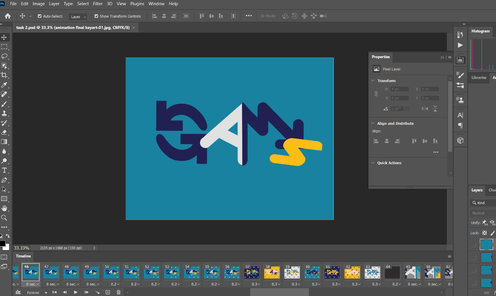
After complete all the frame in Adobe Illustrator, I insert it into Adobe Photoshop to edit it. The timeline for front parts are without delay. However, the middle parts are 0.2 to 0.3 seconds for better visual experience.

Final Animated Key artwork

fig 10.1 Final animated Key Artwork (Week 8, 17.10.2023)

My idea is the letters of key artwork roll into the screen symbolize that everyone is working hard to reach their own position. The behind part shows that the letters have different possibilities in different colours.

Final Key artwork & Collateral

fig 11.1 Final Key Artwork - B&W (Week 8, 19.10.2023)

fig 11.2 Final Key Artwork - Colour (Week 8, 19.10.2023)

fig 11.3 Final Key Artwork - Colour (Week 8, 19.10.2023)

fig 11.4 Final Key Artwork - Animated  (Week 8, 19.10.2023)

fig 11.5 Final Collateral - Colour Palette  (Week 8, 19.10.2023)

fig 11.6 Final Collateral 01 - Wallet (Week 8, 19.10.2023)

fig 11.7 Final Collateral 02 - Keychain (Week 8, 19.10.2023)

fig 11.8 Final Collateral 03 - Bag (Week 8, 19.10.2023)

Feel free to click here to see my Instagram page:

fig 11.9 Final Collateral - IG Post (Week 8, 21.10.2023)


Feedback

Week 4
General Feedback: Wordmark should be understandable by others but at the same time, the combination and use of each elements and graphics must have reason and characteristics. Specific Feedback: There must be an unique symbolism in wordmark to impress people instead of simply combine the elements.

Week 5 Specific Feedback: Concentrate on one letterform's idea which is 'G' and apply it on others letter. The stroke and pattern cannot be too small as it will become invisible. Second feedback is make the 'S' longer and bigger so that the space between 'M' and 'S' can be reduced.

Week 6 General Feedback: Expand our key artworks identity into our chosen collateral with different styles and patterns instead of just copy paste the artworks that done last week. Specific Feedback: The chosen colour palette is weird especially the yellow colour. The letter 'M' is not obvious and maybe can separate the 'M' and 'S' by using different colour. Besides, key artworks should be further expanded.

Week 7 General Feedback: The animation should be included in the IG post. Ig profile need to show personal design style and concepts. Specific Feedback: The overall style for ig post needs to be unified, try to use same elements on it.


Reflection

Experience
I think it is an interesting task when I know that we need to design a key artwork about our name. However, when I started doing it, I am struggle with the way how I design to represent my personality. Besides, for the task 2B - Collateral, I need to found out my identity of the key artwork. A suitable colour palette, design style, elements used and the layout of my design are very crucial as it will reflect our personality. I spend a lot of time on exploring my key artwork's identities and the way to expand it.

Observations
I observed that individuals hold distinct interpretations of their characters, and preferences for styles and presentation methods vary widely. Essentially, everyone has their unique definition of aesthetics. Consequently, we shouldn't judge others' works solely based on our personal aesthetics. Instead, as designers, we can appreciate each other's creations. Additionally, I've observed that capturing the audience's attention on social media, particularly on platforms like Instagram, necessitates a strategic use of color, followed by thoughtful layout and engaging visuals. Undoubtedly, this poses a challenge for posting content that stands out.

Findings
I have come to realize that creating a key artwork and brand collateral are a complex undertaking, demanding careful consideration in decisions such as the brand name, purpose, design, and products. Completing the key artwork for my own name in this assignment brought me a sense of honor and happiness. I take pride in my design as it authentically represents what I aim to express, and I have no regrets about any part of the design process. This experience has been a valuable lesson in applying appropriate elements, colors, and rules to my works. Moving forward, I am committed to giving careful attention to the design concept and composition of each brand I encounter.


Further Reading

fig. 12.1.1 Typographic design: Form and communication (2015)

Reference: 
Carter, R., Day, B., Meggs, P. B., Maxa, S., & Sanders, M. 
(2015). Typographic design: Form and communication. 
Hoboken, New Jersey: John Wiley & Sons, Inc.

Ludd: a typographic expedition

fig. 12.1.2 Bent paper

Bent paper clips informed the original iteration of the Ludd typeface.

fig. 12.1.3 Early letterforms.

A grid brought unity to early letterforms.

fig. 12.1.4 Samples object

Samples of objects that further inspired the Ludd typeface. 


fig. 12.1.6 Compare in different weights

The letter a shown in all weights and orientations of the type family.

fig. 12.1.5 Exploration of letter quirks

A form of typing in which certain letters are replaced by numbers or other symbols that look relatively similar to the original letter, such as using '3' instead of an 'E' or '1' instead of 'I' or 'L'. Typing Quirks are commonly seen as beneficial to people with Dyslexia, as the symbol-replacements catch the reader's attention. They are also commonly used among emo culture, and Homestuck fans.

Others Visual reading

Comments